Packaging Rebrand:
A System for
Flexible Sizes
Digitec Galaxus AG consists of the two largest online retailers in Switzerland: Galaxus and digetec. In order to become more time efficient and reduce plastic filling material, they updated to a fully automated packaging machine. Around 90% of all orders will be processed by this machine, which envelopes them in made-to-measure cardboard boxes. Consequently this process eliminates any pre-defined, fixed package sizes that can be branded in a conventional way. The static branding had to be transformed into a design system capable of being applied to massively different box dimensions.
Realized at Digitec Galaxus AG, 2018
Type: Branding, Packaging
Role: Concept, Art Direction, Graphic Production
Photography: Thomas Kunz
How it Works
Orders are transported into the machine on a conveyor belt. The machine then scans the item's dimensions, choses one of two widths of pre-printed continuous cardboard, cuts and folds it around the products, glues the box shut and adds the shipping label – processing about 700 orders per hour.

Fully automated CMC packaging machine creating made-to-measure boxes
Creating Consistent
Inconsistency
Usually branding elements get places in defined distances from the center or borders of each side of a package. But how can you assure a consistent placement or look without knowing the dimensions the package will have? Not to mention that the next one will have completely different ones?

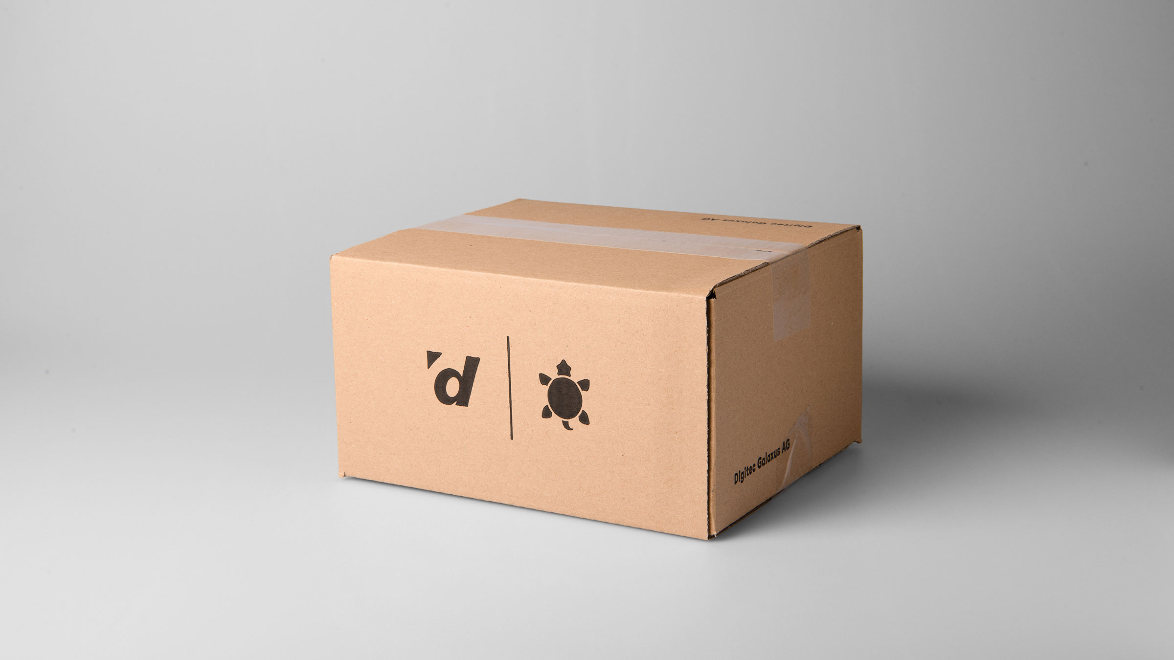
Old package with statically placed branding elements
Process
The center aligned logo band is closest to the former branding, which is rather timid. But even though it would be visible on various sized boxes, it doesn’t actually work that well. Medium and big boxes are left with an awkward amount of white space to the sides and smaller packages have a big portion covered by the center applied shipping label. It also looks rather naked and uninspired; it would be a compromise dominated by restrictions.

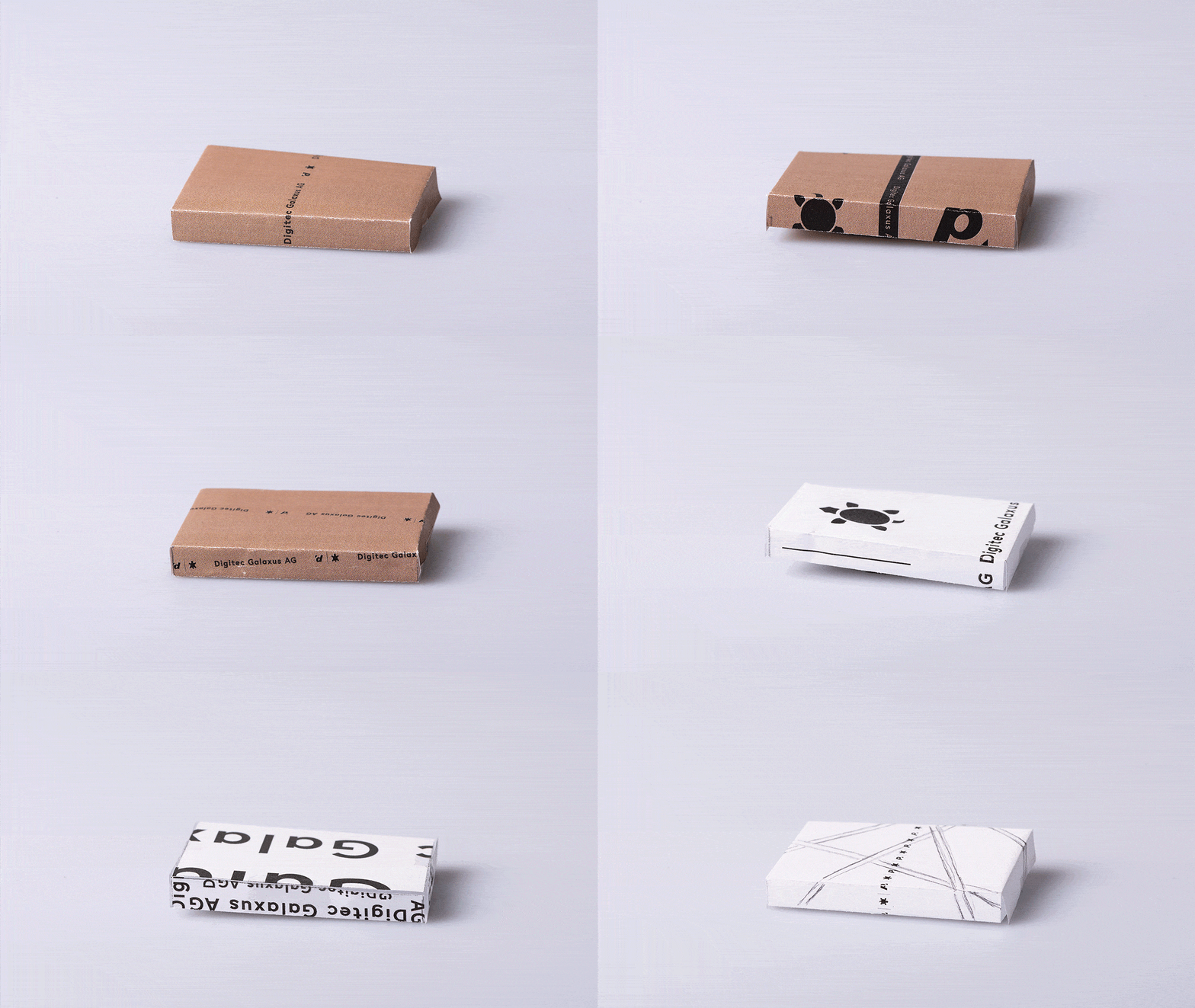
Exploration of possible designs
Conclusion
The only fix point of the packaging process is that all items are being wrapped from the middle of the cardboard. Since the length of the package is unknown, it makes sense to repeat the branding and use the middle of the cardboard to ensure it will be visible on wide and narrow boxes alike. Bigger items will use the wider cardboard, giving the opportunity of scaling the branding: one design for small to middle sized packages and another for the big ones.
Embracing the
Randomness
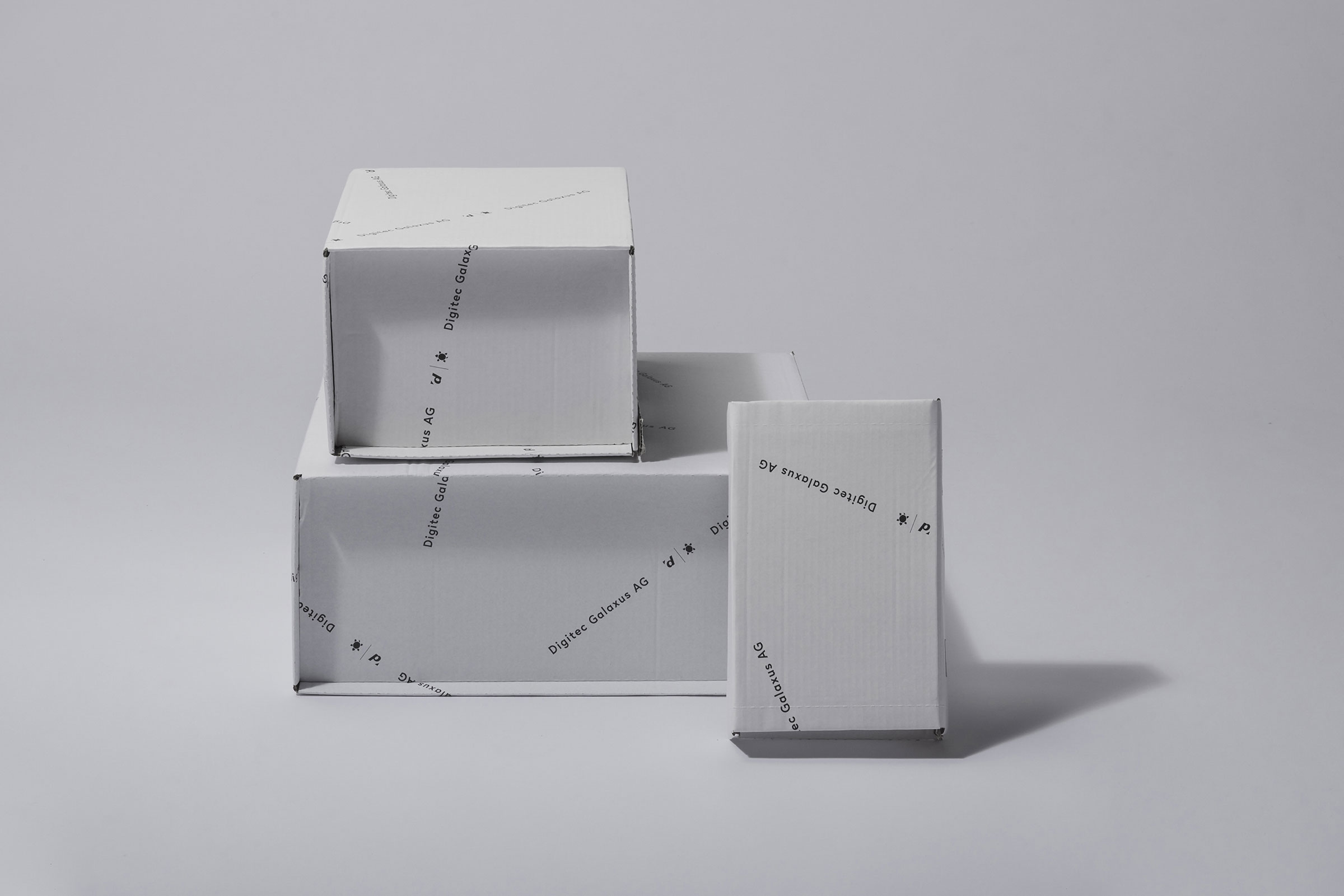
Instead of looking at the changing sizes as a restriction, I started looking at it as an opportunity. I embraced not knowing where folds will occur and even turned it into the concept behind the design. Logo bands will form a random looking pattern and be folded over borders continuing on the other side of the box. This design makes it possible to have branding all over the packages, no matter their size, without having elements look like they are accidentally cut off. The cardboard was switched to white to set it apart from competitors and to allow a higher contrast between branding and background, which greatly improved legibility.

Prototypes of chosen design concept
Refining
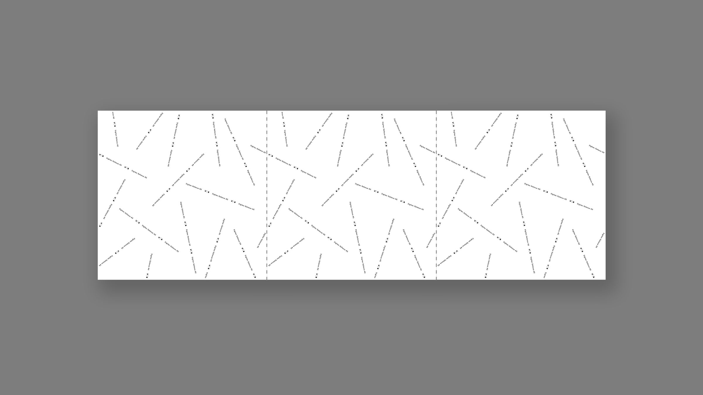
The implementation on continuous cardboard was not without production challenges. The goal was to have no detectable breaks in the pattern, creating the illusion of an endless, rather than a repeating design. To achieve this the pattern needed interlinking parts of the logo band placed at the top and bottom borders of the plate, which will form intact bands in print. On top of that unprintable areas at the edges of the plates had to be considered as well.

Cardboard design of interlinking, endless pattern
Final Design
The design allows successful branding of the new made-to-size packages, is considerate of any restrictions, and reflects the new automated process at its core. Furthermore it has improved the packaging's recognisability, making the brand more visible in the outside world.


© 2025 Miriam Brack